KAIMANA
STONEWARE
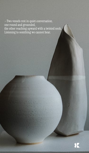
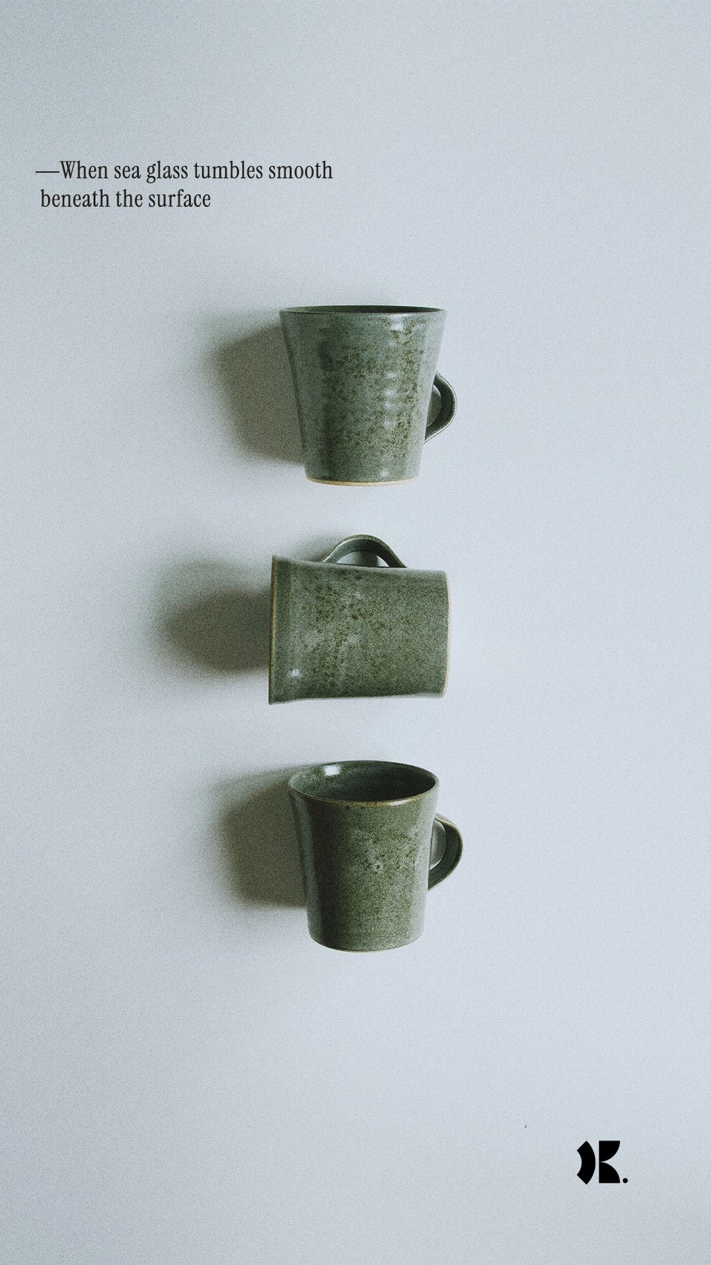
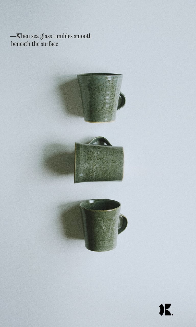
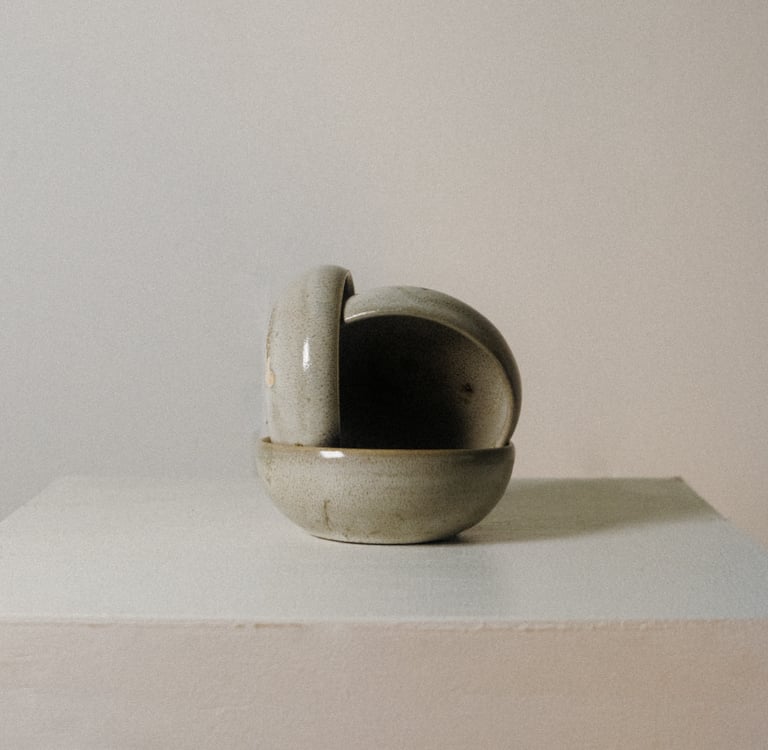
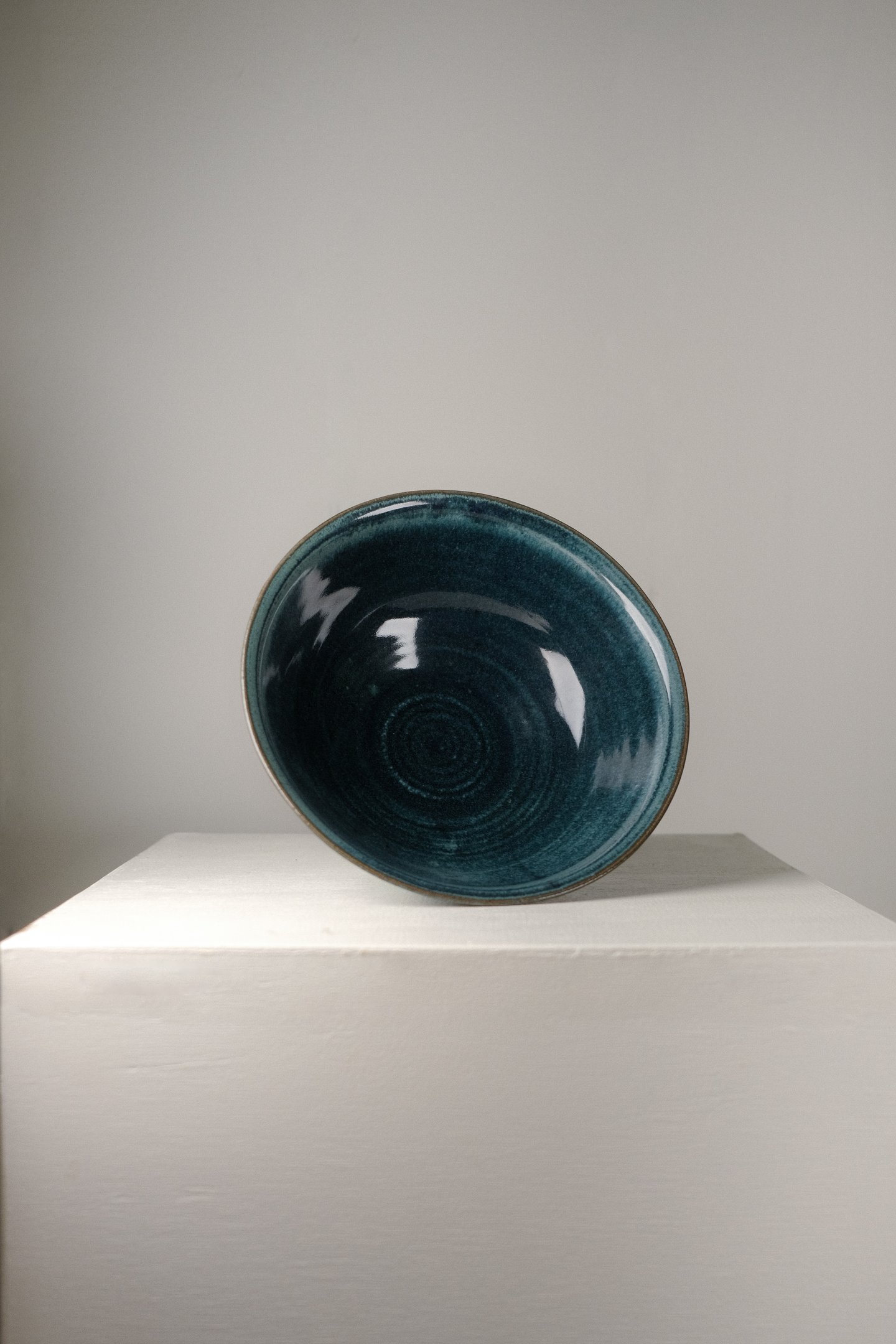
Ceramics has long been intertwined with Zen philosophy, reflecting the wabi-sabi aesthetic, which embraces imperfection and the natural world's beauty.
Inspired by minimalist designs, earthy tones, and tactile textures, kaimanastoneware serves as a tangible reminder to live authentically and mindfully.
In a world where everyone is on the go, the idea was to encourage appreciation for the rawness of life and the significance of being fully present in each moment.
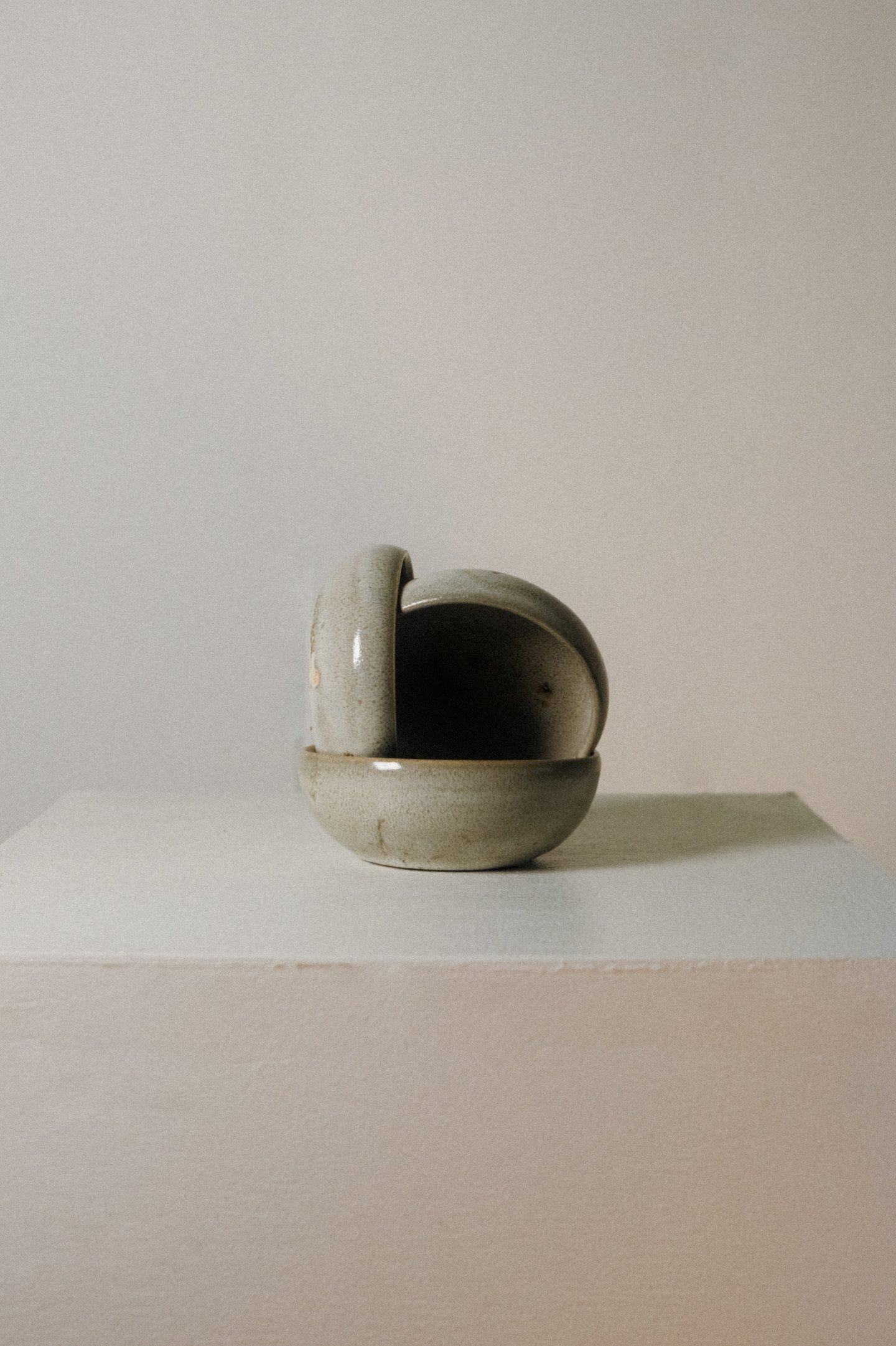
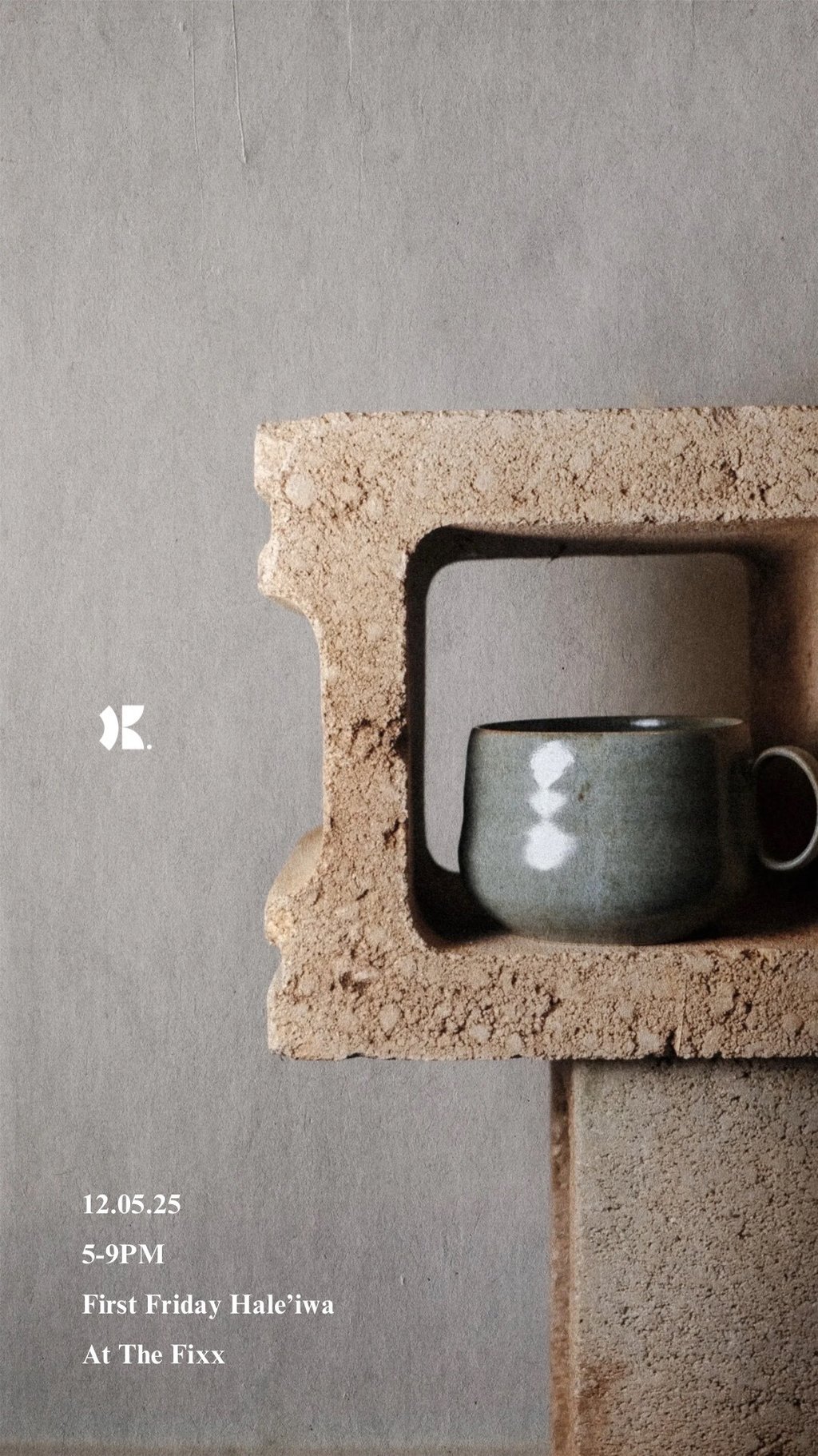
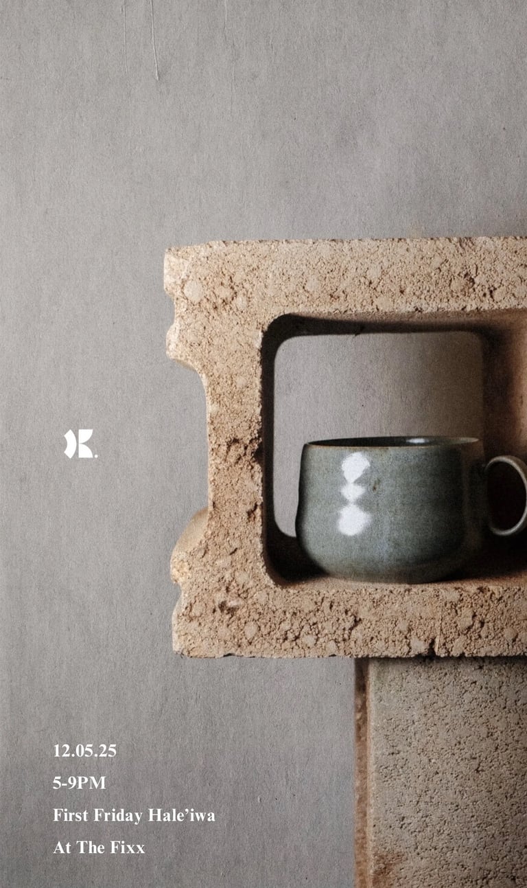
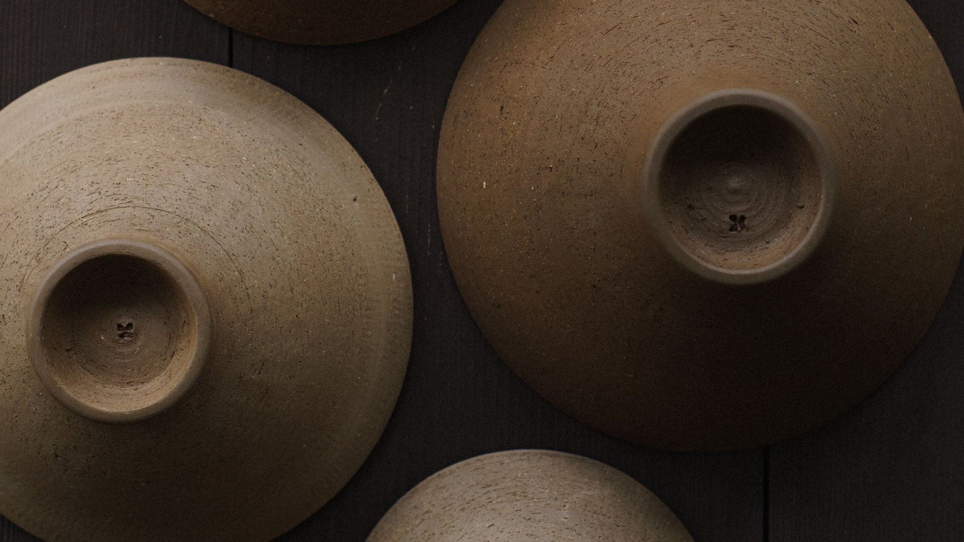
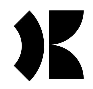
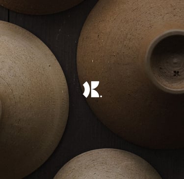
In Japan, a hanko stamp is used as a form of identification on documents and is usually a person's name or initials.
Designing the logo needed to be simple yet eye catching, as it would be used as an artist stamp on each ceramic piece.
The logo was designed to represent the initials KB by combining a mirrored quarter circle. This represents the two halves of a ceramic mug, which are used both to form the K and B. The quarter outlined circle was used to form the handle of a mug, completing the look of the K.


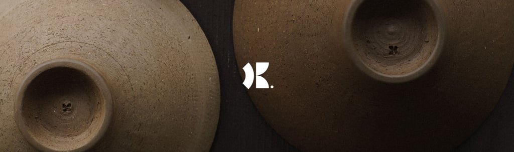
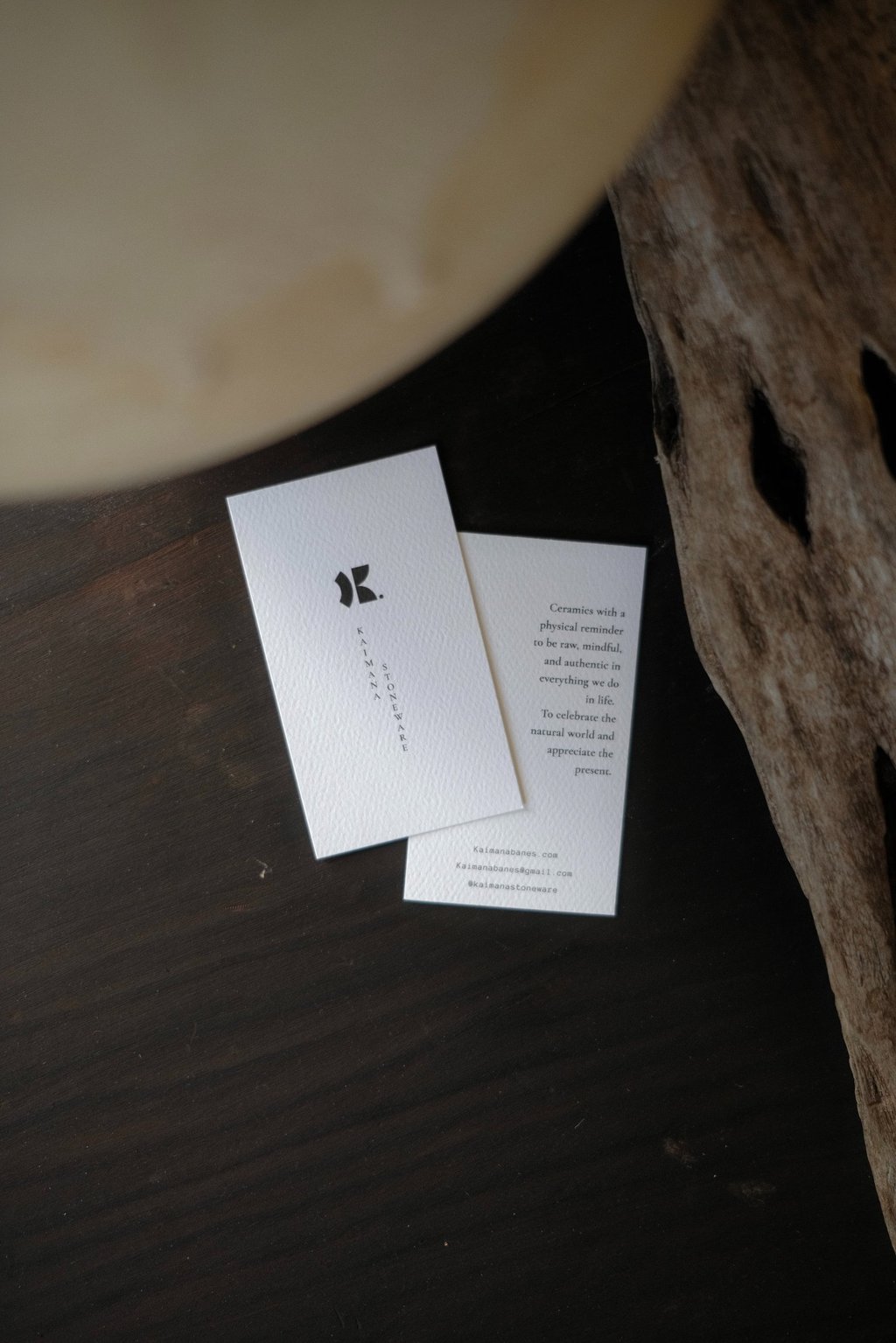

The Logo would be stamped very small on the bottom of the pieces, and the graphics would include small typography with thought provoking wording. This encouraged people to stop, lean in, and reflect.
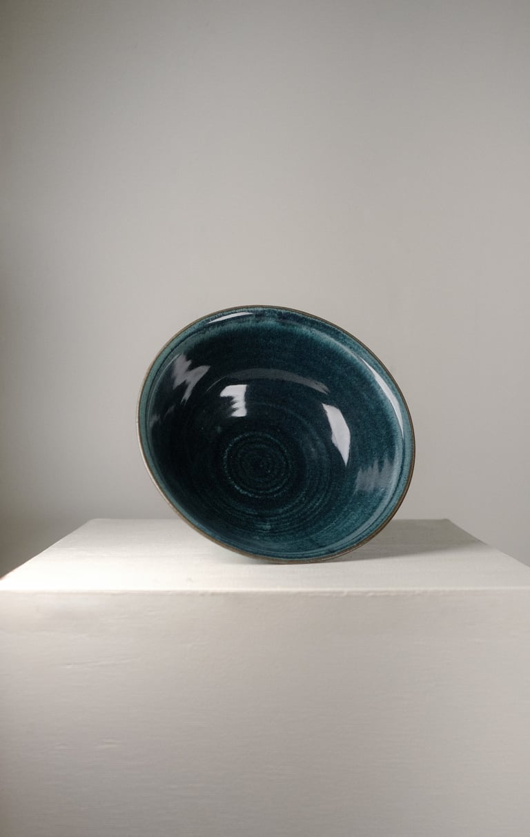
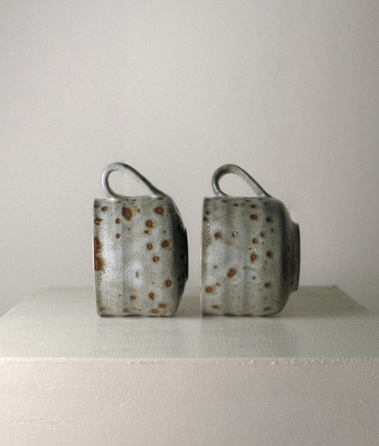
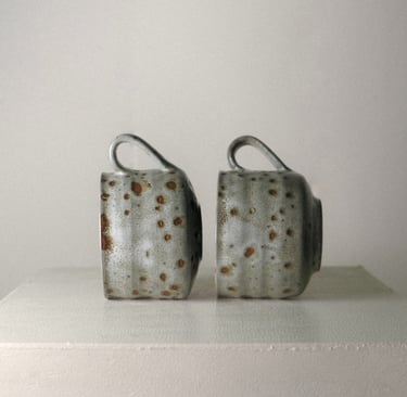
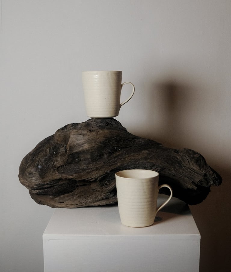
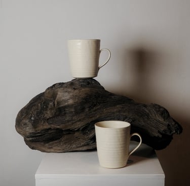
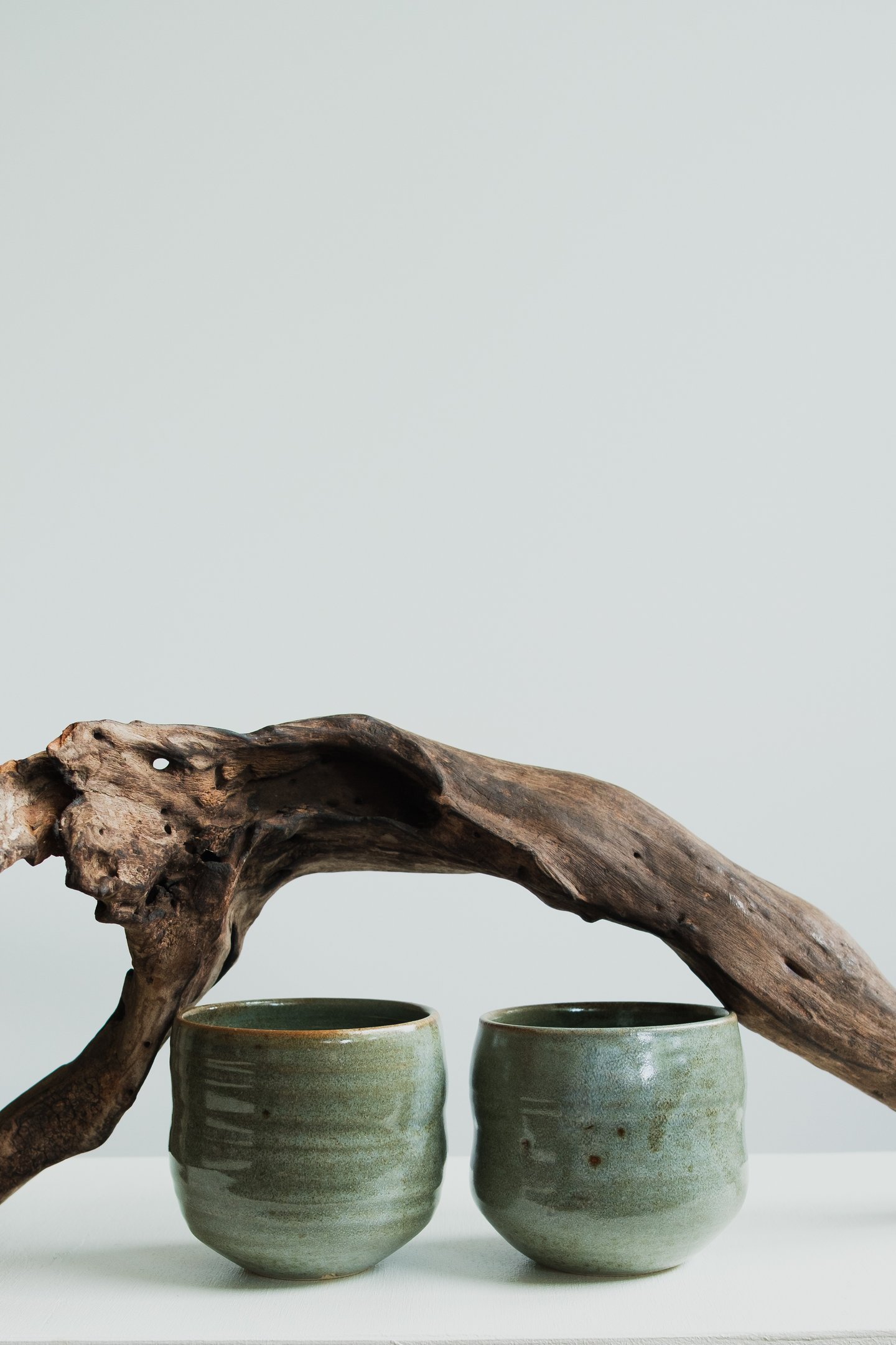
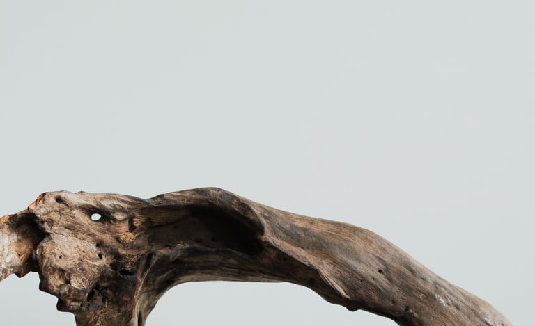
Visuals remained minimal and centered around tranquility and stillness. Often, the use of outside materials were contrasted on a blank white canvas to highlight its textures and organic feel.
The use of driftwood is a homage to Kaimana's grandmother, who was an Ikebana(Japanese flower arranging) teacher who created her own style around driftwood.